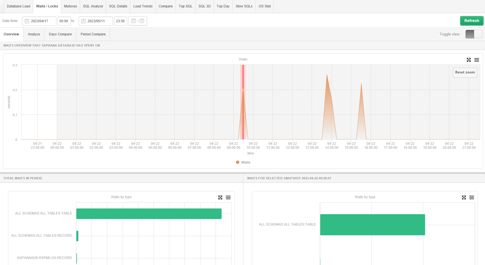
The screen allows you to analyze the level of waits/locks for all processes running in the
database during the analyzed time. The Y-axis of the graph shows in seconds per second the
time of all waits that occurred during the presented period. The X-axis of the graph
represents the time at which the waits occur.
The graph is “clickable.” Pointing to a point on the graph will display a summary of waits,
specific to the snapshot in time.
From the above chart we can see: